


Use this tutorial to complete a first analysis in FineBI Cloud. You will upload an Excel file, filter records in an analysis table, create a chart, build a dashboard, and create a storyboard.
Before You Start
You need access to FineBI Cloud and prepare an Excel file. This tutorial uses a retail sales scenario. The example fields include Store Type, Brand Description, Sales Amount, and Sales Region.
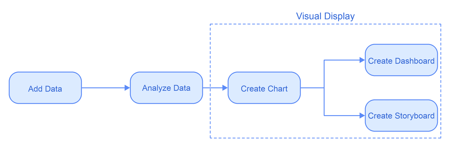
Tutorial Path
| Task | What You Will Learn |
|---|---|
| Add Data | Upload an Excel file and create an analysis table. |
| Analyze Data | Open the uploaded table and use analysis steps to process data. |
| Create a Chart | Build a chart from the prepared data. |
| Build a Dashboard | Create a dashboard with charts, filters, and other components. |
| Create a Storyboard | Explain analysis results with text, analysis steps, and charts. |
Add Data
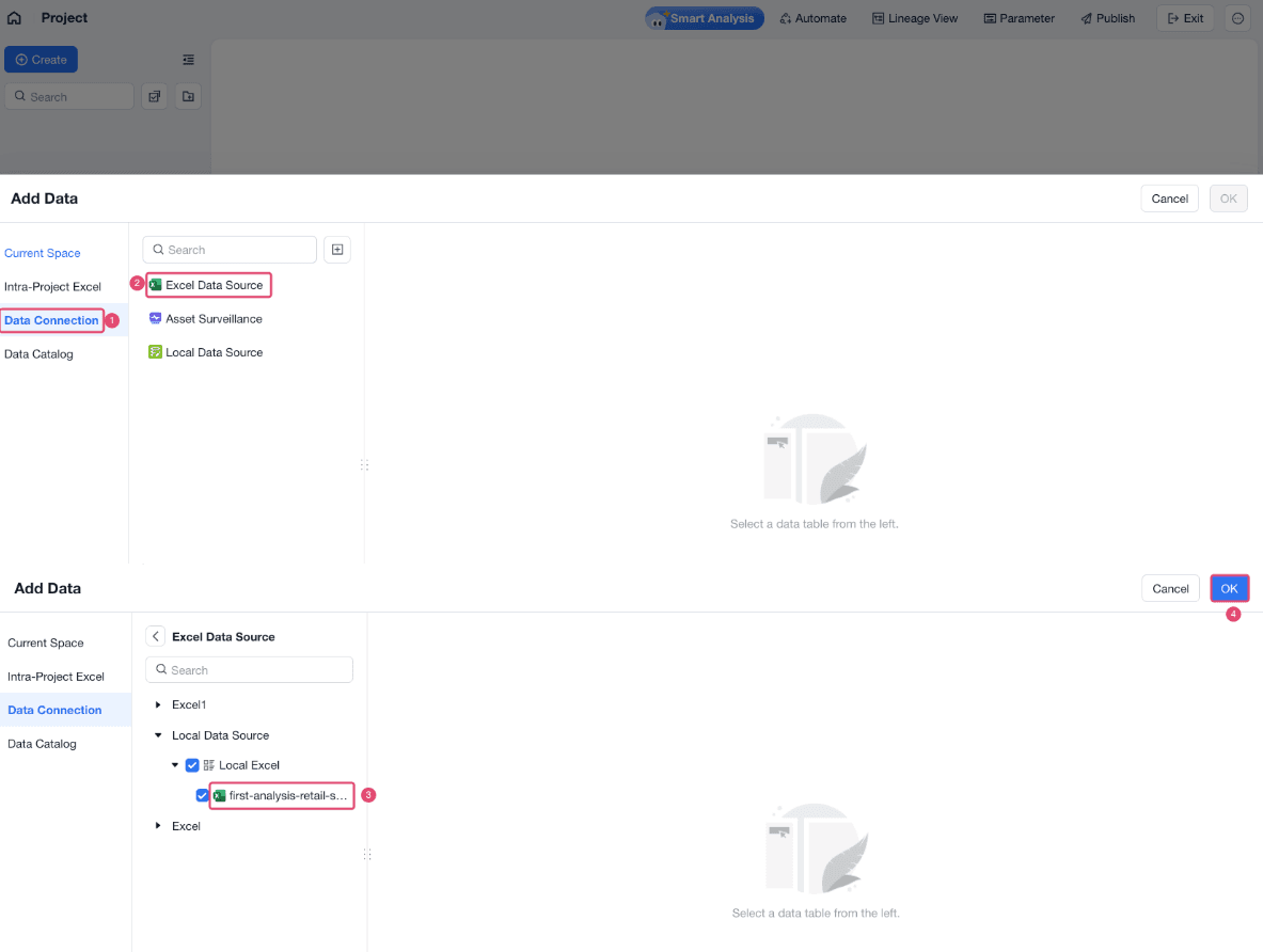
Data is the starting point for every analysis. In this tutorial, upload the sample Excel file in Data Connection first. You can then add the uploaded table to a project for analysis.
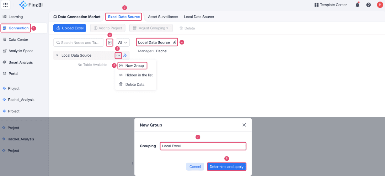
Choose Connection > Excel Data Source, create an Excel data source, and create a group.
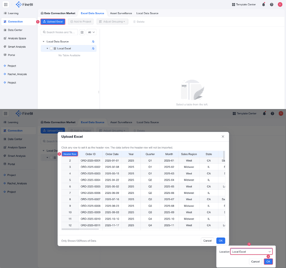
Click Upload Excel, select the file, select the required sheet, and set the header row and file location to upload the sample Excel file.
If the Excel file contains multiple sheets, select the sheets that you want to upload. Each selected sheet is uploaded as a separate table.
FineBI Cloud uses the first row as the header row by default. If your column names are in another row, set that row as the header row. After upload, the header row cannot be modified.
Analyze Data
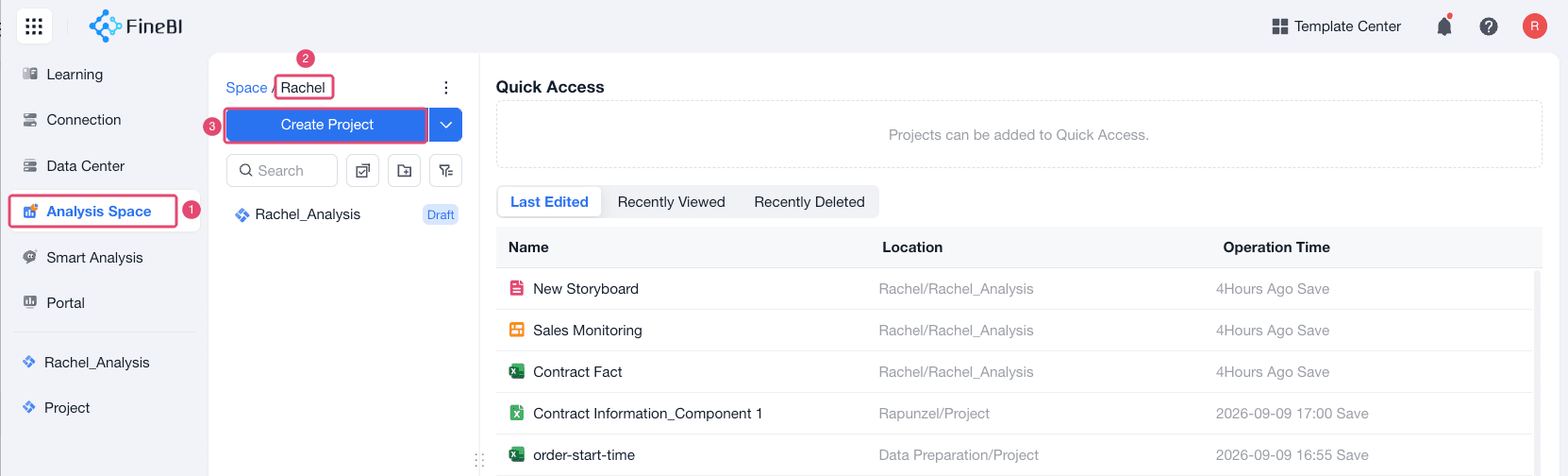
Projects are the workspace for analysis. After the sample Excel file is uploaded, create a project in Analysis Space and add the uploaded table to the project.
Click Analysis Space, enter the correct space, and click Create Project.
In the project, select the uploaded Excel table.
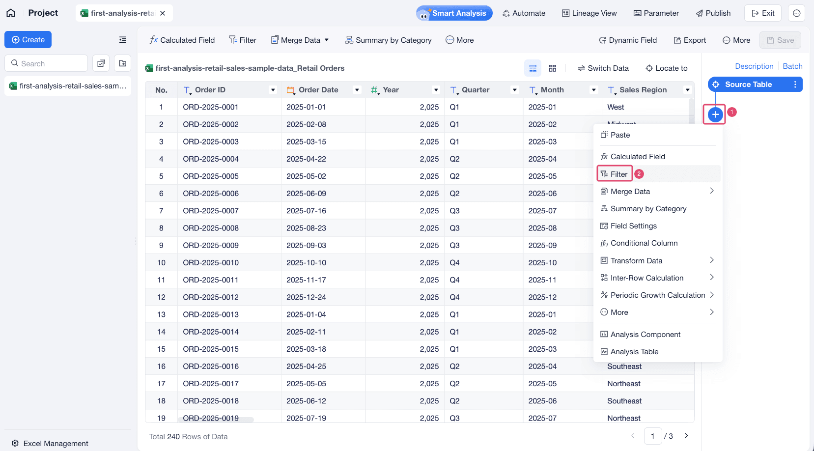
Open the analysis table. Click + to add analysis steps. This step takes adding a Filter step as an example.
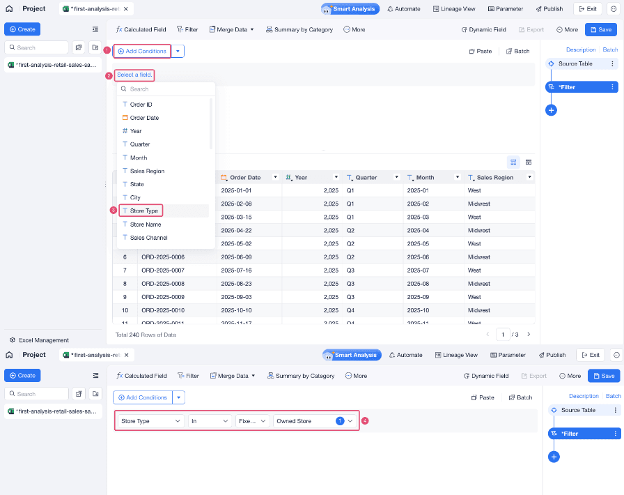
Set a condition on Store Type and keep only Owned Store records.
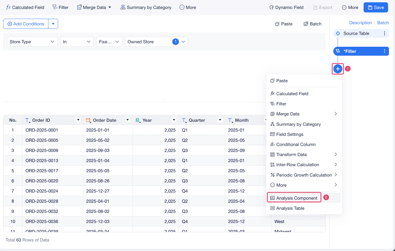
After the filter step is applied, the data is ready for chart creation.
Create a Chart
Charts help you present prepared data visually. In this tutorial, create a bar chart that shows total sales amount by brand.
In the analysis steps area, choose Create > Analysis Component.
Set Chart Type to Grouped Column Chart, drag Brand Description to X-Axis, and drag Sales Amount to Y-Axis.
FineBI Cloud shows the total sales amount for each brand.
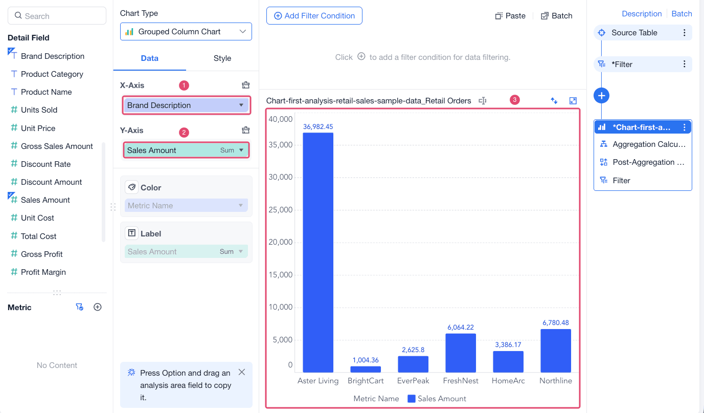
Click Save.
Build a Dashboard
A dashboard brings charts and components together on one page. You can use dashboards to monitor key metrics, compare business areas, and help viewers understand the analysis at a glance.
In the project, choose Create > Dashboard and create a blank dashboard.
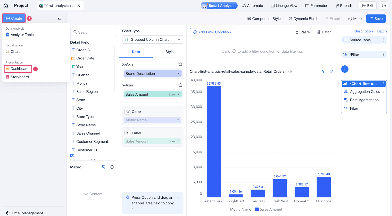
From the chart list, drag the grouped column chart onto the dashboard canvas. Resize and reposition the chart as needed.

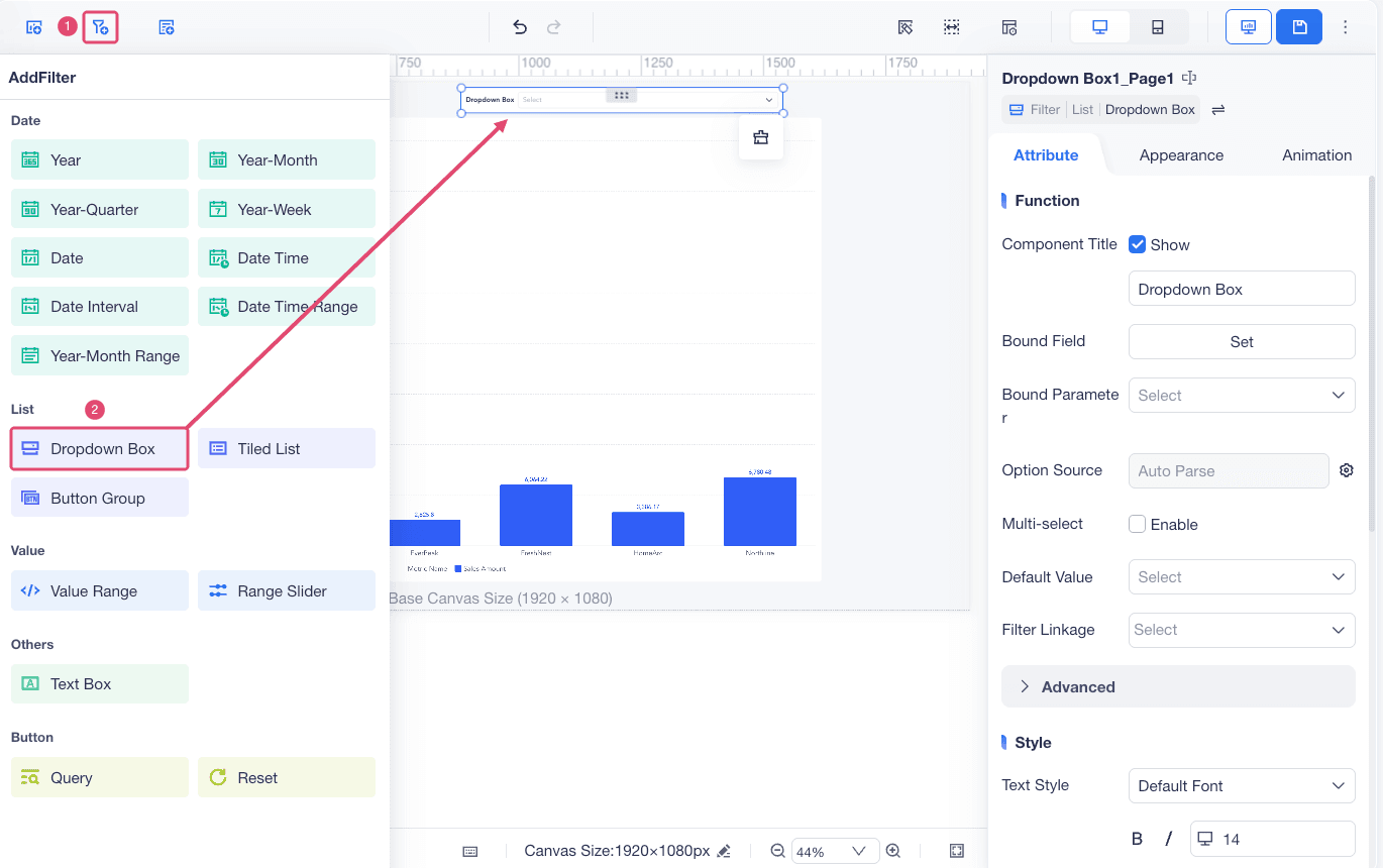
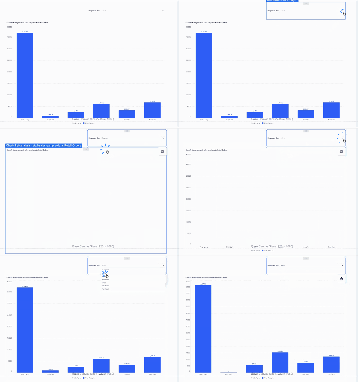
Click the filter icon and drag filters onto the dashboard. This step takes adding a Dropdown Box filter as an example.
Select the dropdown box filter, click Set in Bound Field, and bind it to Sales Region.
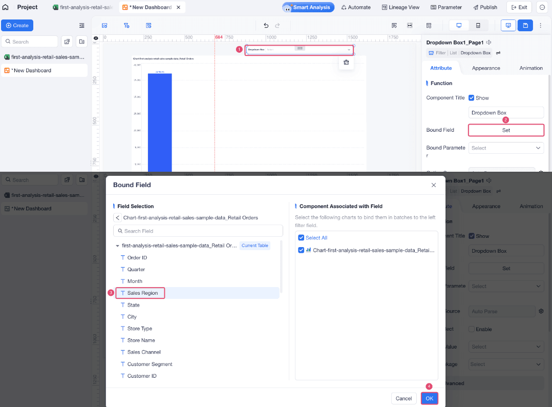
When you select a region, the grouped column chart updates to show sales by brand for that region.
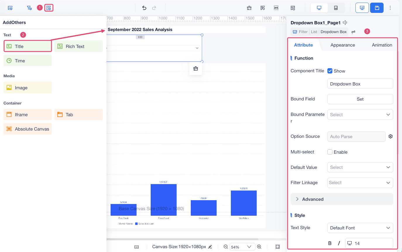
Click the others icon, drag a Title component onto the dashboard, and enter a title such as September 2022 Sales Analysis. Set style for the title.
Create a Storyboard
Use a dashboard when you only need to present charts. Use a storyboard when you also need to explain the calculation process, show analysis steps, and make convincing presentations.
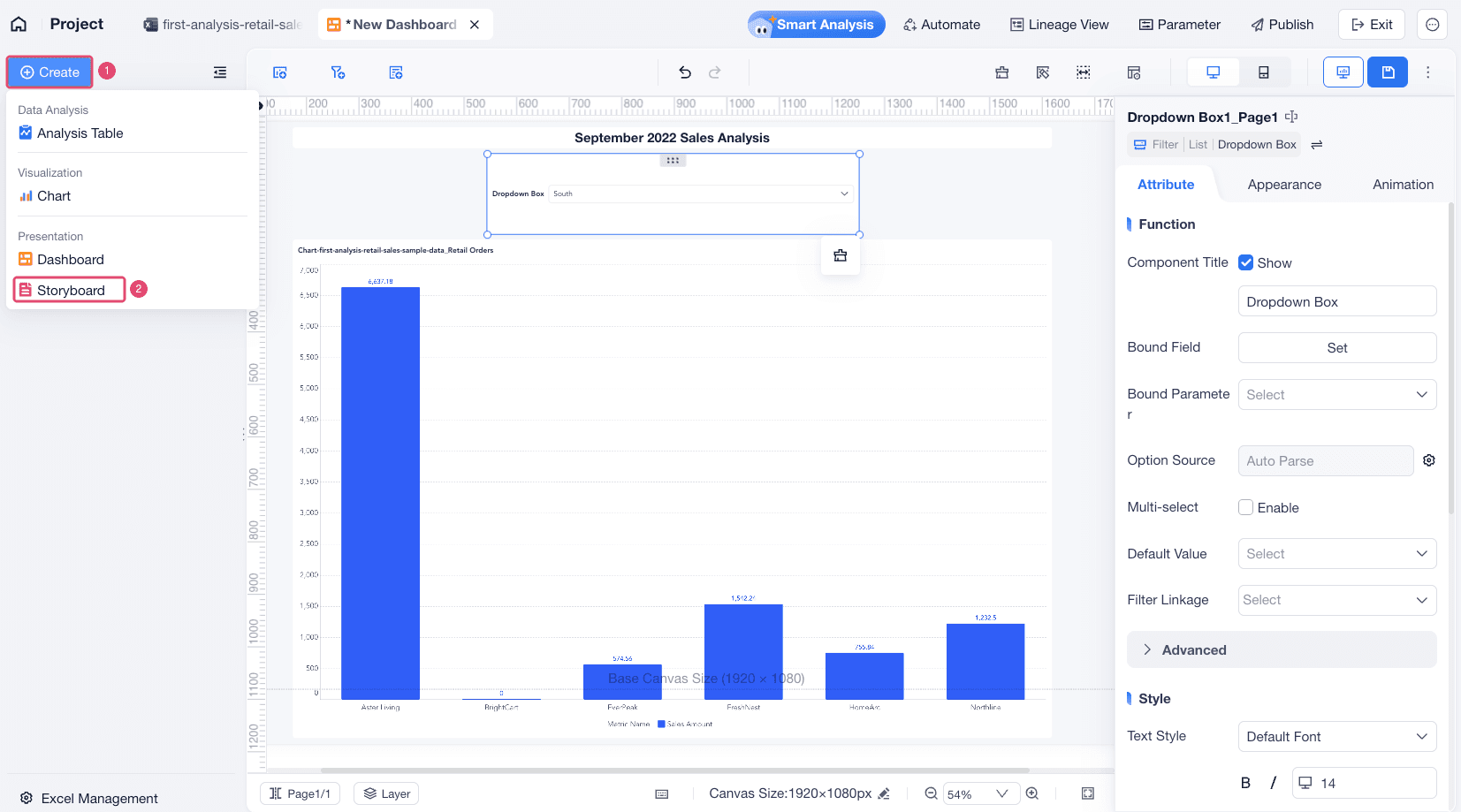
In the project, choose Create > Storyboard.
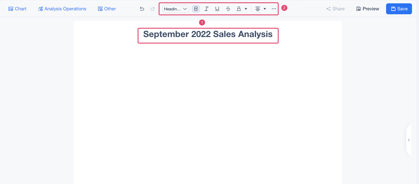
Add text to the storyboard and set the text style, such as heading level, color, and alignment.
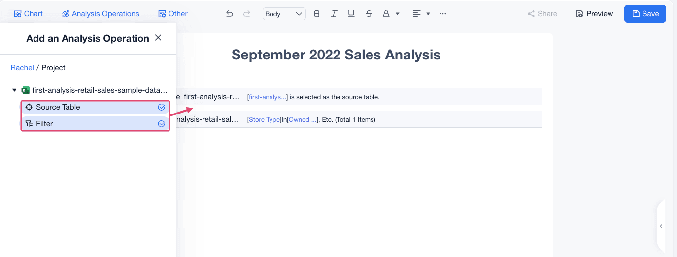
Choose Analysis Operations, select a analysis step, and drag it into the storyboard.
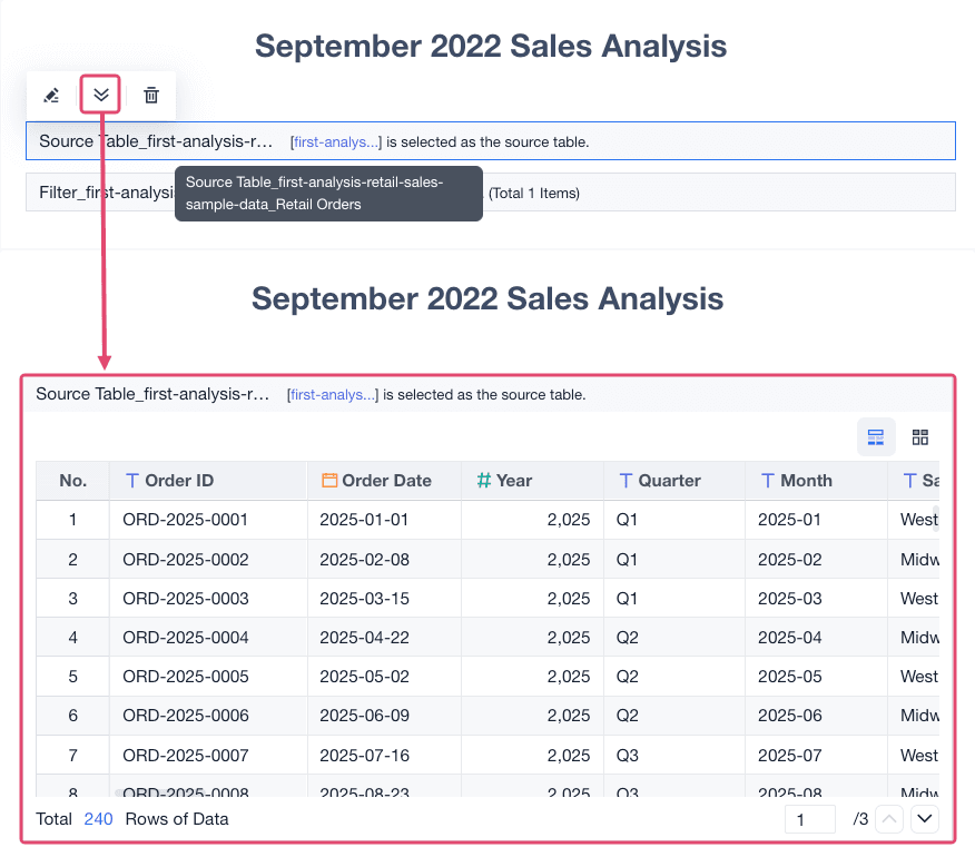
Viewers can expand an analysis step to check its data result.
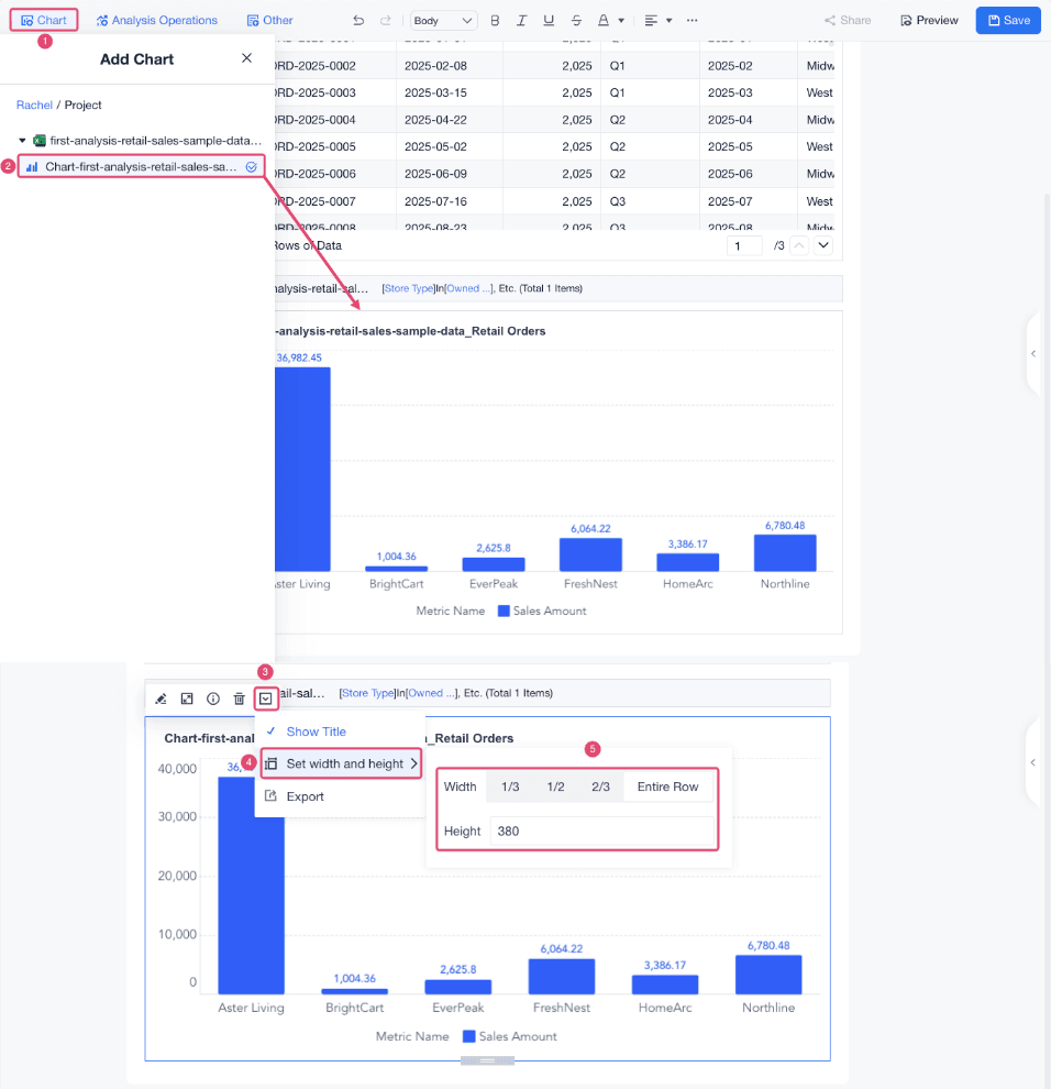
Click Chart, drag the grouped column chart into the storyboard, and adjust its width and height.
Result
After completing this tutorial, you have a prepared analysis table, a grouped column bar chart, an interactive dashboard, and a storyboard that explains the analysis process.
Next Steps
- Connect your own data source.
- Learn more analysis steps, such as adding calculated fields and merging tables.
- Explore more chart types.
- Add dashboard interactions such as drill-down and linkage.
- Publish or share your dashboard and storyboard.