


Use this guide if you are an editor who needs to create analysis content in FineBI Cloud. You will upload an Excel file, create a project, prepare an analysis table, create charts, and build a dashboard.
Before You Start
Make sure your organization admin has added you to FineBI Cloud and granted you access to the space where you will create analysis content.
This guide uses a retail sales Excel file. The file includes fields such as Store Type, Brand Description, Sales Amount, and Sales Region.
What You Will Create
| Step | Result |
|---|---|
| Upload Excel data | A reusable Excel data source is available in FineBI Cloud. |
| Create a project | A workspace is created for your analysis content. |
| Prepare data | An analysis table keeps only the records you need. |
| Create charts | A detail table and a chart are created from the prepared data. |
| Build a dashboard | The charts are arranged on a dashboard with an interactive filter. |
Open FineBI Cloud
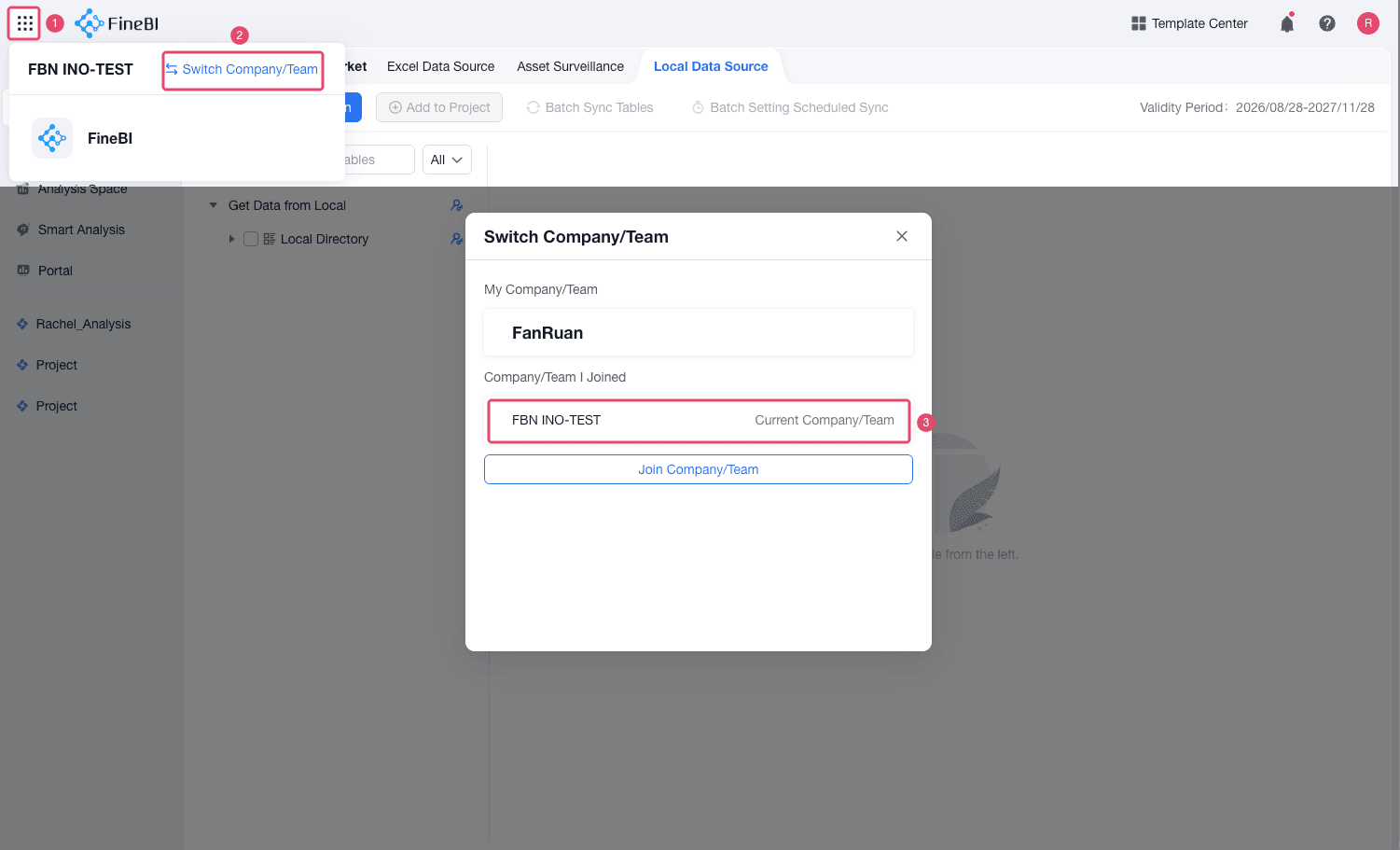
Click the organization switcher in the upper-left corner. If the current organization is not the one you want to work in, switch to the correct organization.
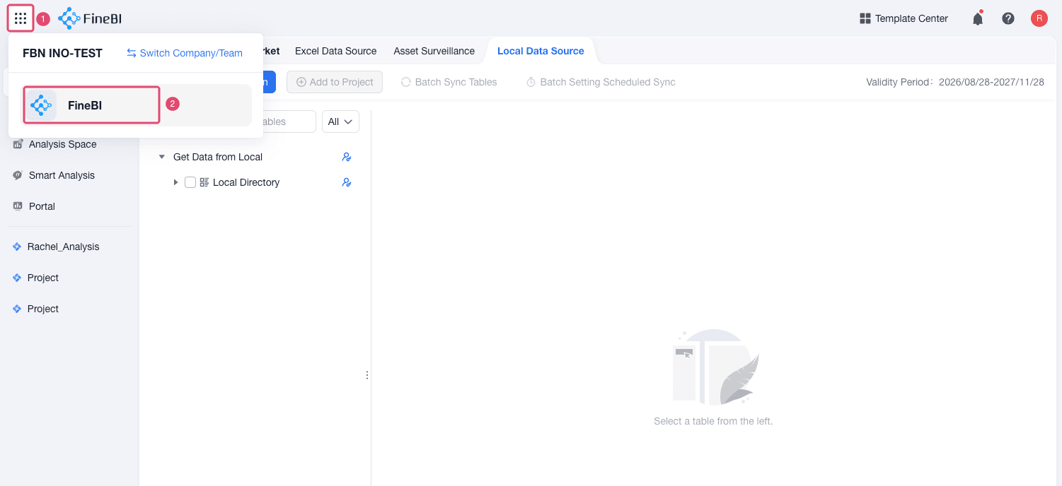
Select FineBI from the product list.
Create a Project and Add Data
A project is where editors add data, prepare analysis tables, create charts, and build dashboards.
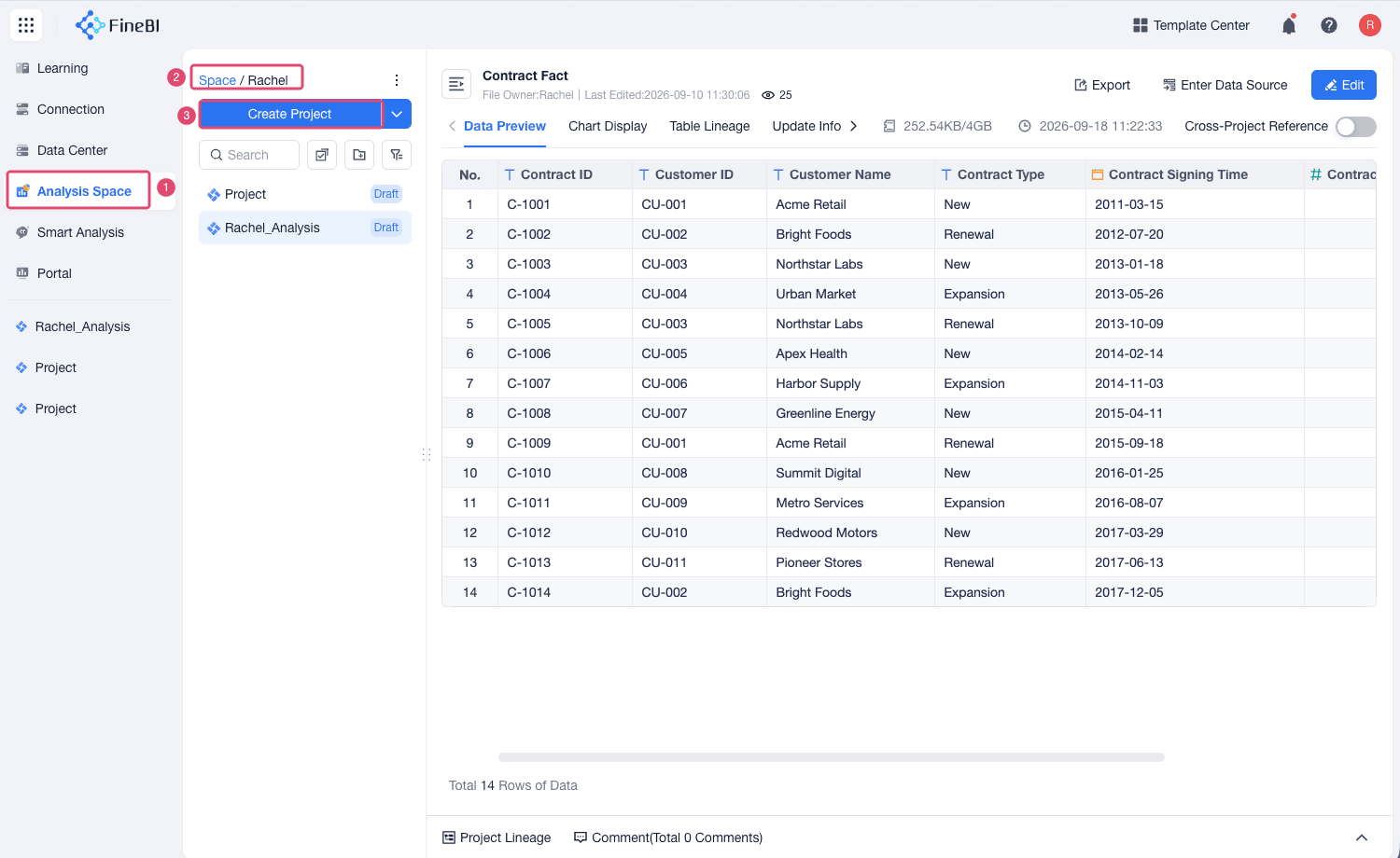
Click Analysis Space and create a project in a space where you have permission.
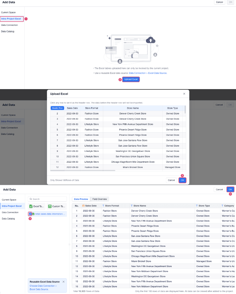
Choose Intra-Project Excel > Upload Excel on the pop-up Add Data dialog, and upload the retail sales Excel file.
FineBI Cloud adds the selected sheet to the project as a table.
Prepare Data
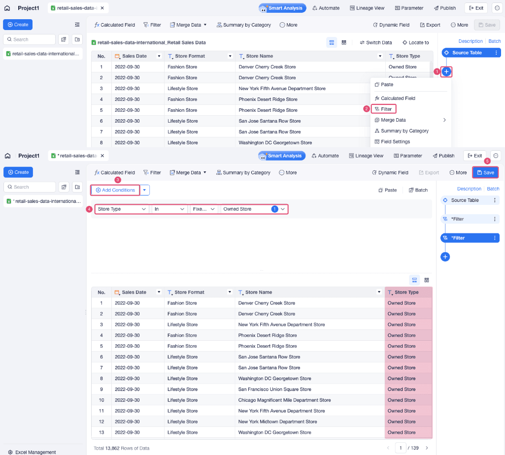
The uploaded table is open as an analysis table. You can edit it in the project using steps such as Calculated Field, Merge Data, Summary by Category, Filter, Sort, and Field Settings.
In this example, add a filter to keep only Owned Store records.
Create Charts
Use charts to present the prepared data in a format that is easier to read and compare.
Create a Detail Table
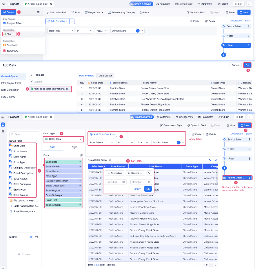
Choose Create > Chart, and then select the prepared analysis table as the source data.
Select Detail Table as the chart type.
Drag the fields you want to show into the Data area. You can also sort and filter data in the chart editor.
Rename the chart, such as Sales Detail Table, and then save it.
Create a Sales Chart
Create a chart from the same prepared analysis table.
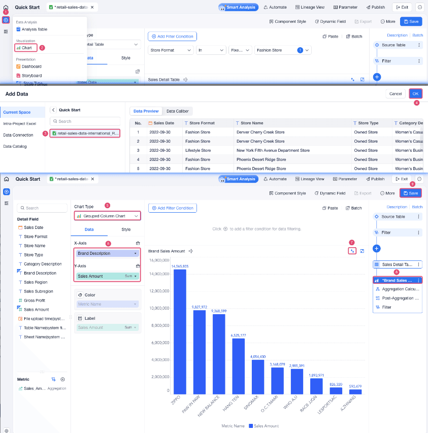
Select Grouped Column Chart.
Drag Brand Description to X-Axis, and drag Sales Amount to Y-Axis.
Add filters, sort, or other calculations. For example, sort brands by Sales Amount(Sum) in descending order.
Rename the chart, such as Brand Sales Amount, and then save it.
Build a Dashboard
A dashboard brings multiple charts and components together. Use it to present key results and let viewers filter the data interactively.
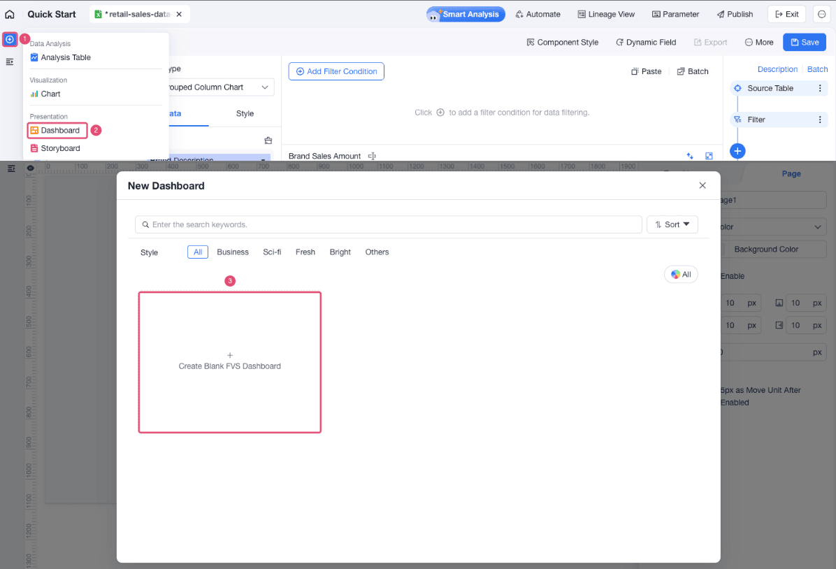
Choose Create > Dashboard and create a blank dashboard.
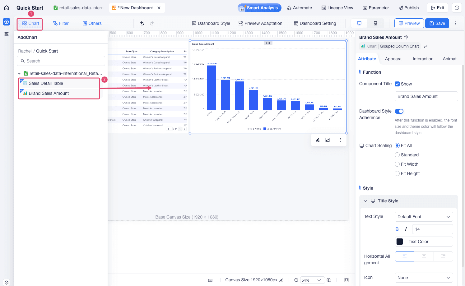
Click Chart and drag the detail table and sales chart from the chart list onto the dashboard canvas. Adjust their position and resize them as needed.
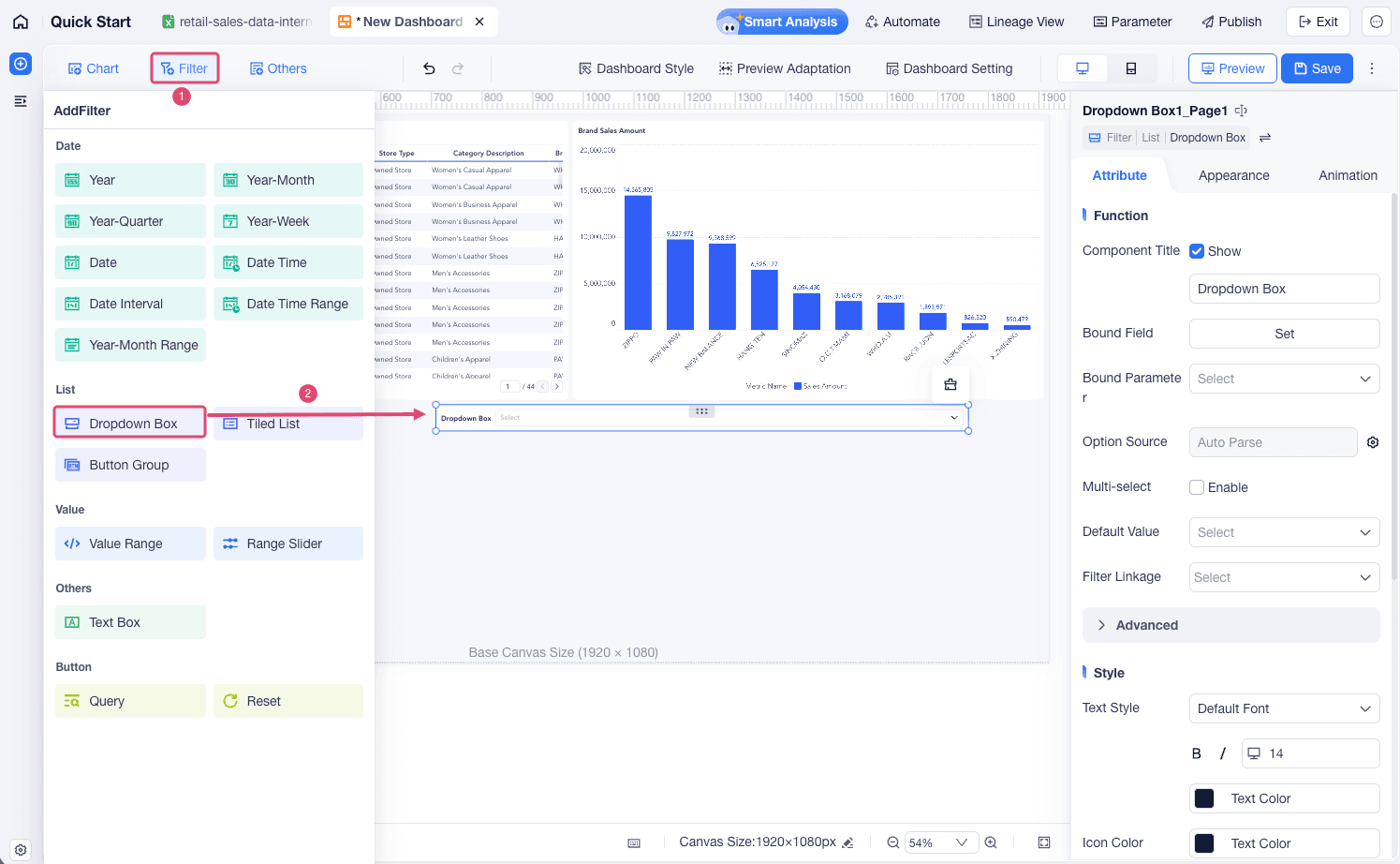
Click Filter and add a Dropdown Box component to the dashboard.
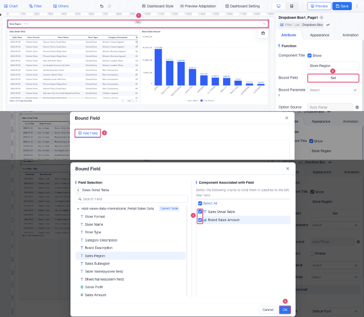
Bind the dropdown box to Sales Region and select the chart components that should respond to the filter.
When viewers select a sales region, the related charts update to show data for that region.
Save the dashboard and preview it. Check whether the charts display correctly and that the dropdown filter updates the related charts.
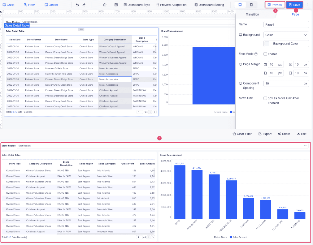
Result
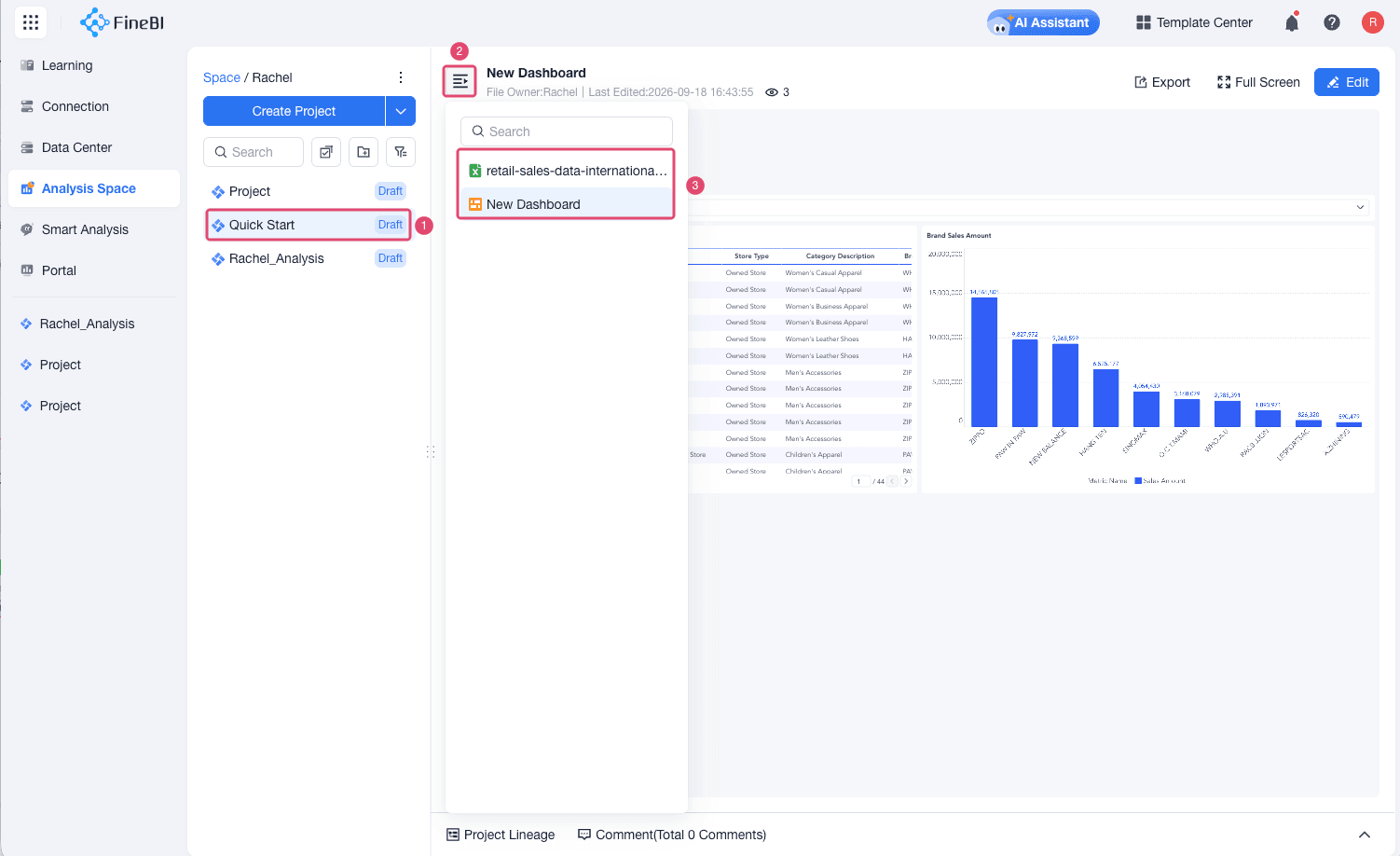
You now have a project that contains an uploaded Excel table, a prepared analysis table, charts, and an interactive dashboard. You can view the table and dashboard on the project overview page.
Next Steps
- Connect your own business data.
- Add more analysis steps, such as Calculated Field, Merge Data, and Summary by Category.
- Create more types of charts for different analysis questions.
- Share or publish the dashboard when it is ready for viewers.